And for the umpteenth time, I got the same frustrating result: an index map that lacked any kind of useful data. Sure, at first glance it looks pretty:
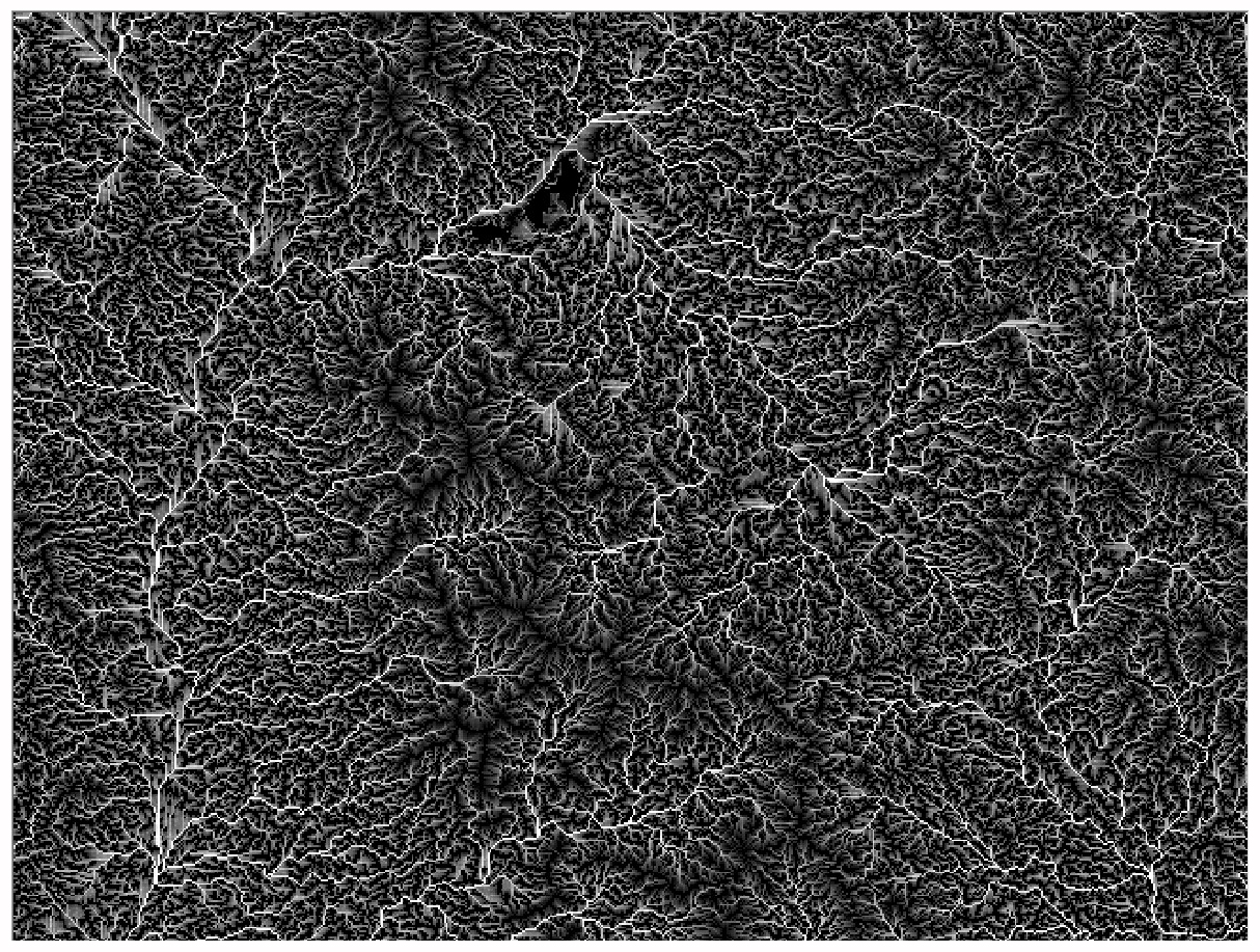
Looks kind of like the blood vessels in a lung – not a very far-fetched analogy, considering that the white and the grey is supposed to show places with potentially higher soil moisture, based on topographical conditions. A topographical wetness index, as it is called. The blood stream of the landscape: rivers and seasonal springs.
But then I look at the actual numbers, and realize that the index calculation has failed for more than half of the pixels in the image.
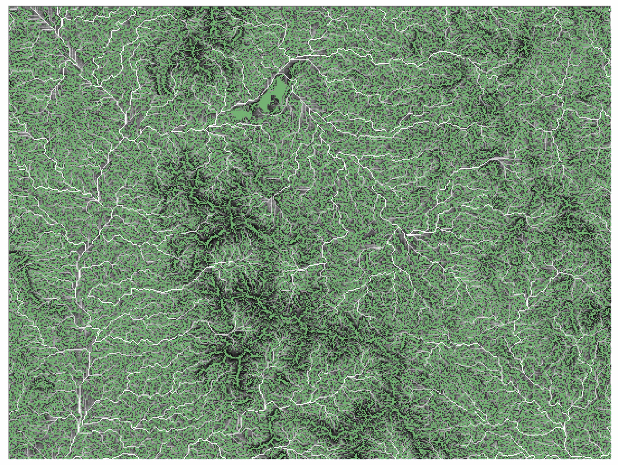
Everything that is green is No Data. Calculations failed. Something with the input data is wrong. A poor quality digital elevation model, a free of charge global product and I guess you get what you pay for.
Lisa sits next to me in the master’s computer lab, working with amazing LiDAR data. High-resolution elevation data captured with an aircraft-borne laser machine. In it, even single trees can be separated, as well as the tree-tops from the ground. Many Swedish municipalities are acquiring these products now, for better planning and monitoring purposes. Lisa is developing a method for mapping old deciduous tree alleys as corridors for biodiversity protection.
In Burkina Faso, data access is very limited. My job now is to create data from basically nothing. It isn’t going particularly well. Why did I choose this? Why do I make things hard for myself?
